Sunday, 5 February 2012
Evaluation Question 1: How does your product use, develop or challenge forms and conventions of real media products?
From my research into the horror genre, I learned that establishing the mood of the trailer was essential in any horror film, even one that attempts to challenge conventions. Therefore I decided to use horror codes and conventions in the logo for the production company and the establishing shot of the school. In Photoshop I merged the images of the skull and the moon (typical horror iconography) I found on the internet and specifically used colours that had connotations of fear and horror to immediately prepare the audience for the trailer. I also introduced the sound that is used in the rest of the trailer as a bridge between the logo and my footage. Additionally, the colour scheme is continued into the next shot in where I changed the hue of the video in iMovie. I was inspired by one of the opening shots of the trailer 'Grave Encounters' (which I analysed in my research) to film the setting at an unusual angle to suggest disorder, however I reviewed the various shots I took and decided to use a frontal image. This is an example of how I developed conventions as I adapted some of the features and kept others.
The interior shot shows how I have used conventions again. It could be argued that I have applied Mulvey's Male Gaze (though unintentionally) in choosing to focus on 3 female characters, one with a low cut top. In spite of this, my intention was to use to convention of applying
Target audience conventions
Characterisation -stock characters/stereotypes
The disruption of equilibrium in the following scene is another use of form and convention within my product. Todorov's theory states that a narrative must feature the disruption of the equilibrium, something I identified in all of the trailers I researched. My use of this convention is not just evident in the dialogue and acting but also the diegetic sound and shifting of camera angles help suggest to the audience the plot has taken a turn for the worse.
Tuesday, 24 January 2012
Monday, 9 January 2012
Evaluation of Planning
In what ways does your media product use, develop or challenge forms and conventions in the Horror genre?
In our film trailer we have represented the genre using various aspects such as characterisation, themes, settings, iconography, typography and colour and sound. In planning the trailer, we considered how the product would challenge conventions as well as adhering to them.
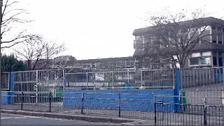 The trailer's establishing shot is suggestive of the horror genre as it depicts a stark, cold (implied by the adjustments to the hue) environment. The framing of the trees and the imposing building tells the audience from the outset


The characters portrayed in the trailer are stock characters which the audience would recognise and help them to identify the genre of the trailer.


Thursday, 8 December 2011
Designing main titles and the film poster


I decided to use this font, Times and Times Again, as it is a serif, commonly associated with horror films and because it has a creepy, distorted feel to it and close kerning between the characters. I think the mix of upper and lowercase letters in the title adds to the dramatic effect created by the contrast of colours in the main title and poster.

I used layer effects in Photoshop to give the poster a grim, grungy look
Editing: Log sheet
Whilst filming, we have also begun the editing process using iMovie but before that we reviewed our footage using a log sheet. As you can see, the log sheet is very helpful in allowing us to organise the clips we will use in our trailer and make decisions regarding what needs to be re-shot due to visual or audio issues. Using the time markers I made on the log sheet (e.g. "00:02 to 00:12") in iMovie also sped up the process of cutting the clips.


Subscribe to:
Comments (Atom)